Sunday 4 January 2015

Art Nouveau Design Essay

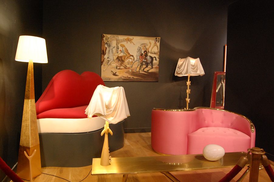
Art Nouveau was an art and design movement that originated from 19th century Western Europe till the First World War. Art Nouveau was a style that influenced a lot of media, from art to architecture and furniture because of its decorative and organic nature. (The History of Art Nouveau – Painting-Drawing-Artist Documentary, 2014)


The idea of this movement was born when British artists saw Japanese designs. At that time, Japanese art style was new and original for the British as well. Art Nouveau was a movement that was mainly inspired from nature itself. Thus, designers and artists relied on many organic forms and shapes, very decorative material and patterns and the sense of flow. Art Nouveau was also influenced from the arts and crafts movement as they focused a lot on the aesthetics of the object. Opposite to the arts and crafts movement, Art Nouveau designers were quite happy with mass production. (The History of Art Nouveau – Painting-Drawing-Artist Documentary, 2014)

Many Art Nouveau designers believed that the function of the object should follow and shape its form.

Art Nouveau design had two different styles, one that consisted more of organic and decorative style while that of German Art Nouveau consisted more of geometric forms and were less decorative than the organic ones. (Lecturer’s notes)

The Majolica House is a clear example of organic Art Nouveau design by Otto Wagner. At that time, Wagner was part of the Secessions movement and they mark a new and revolutionary way of enlightenment. Although the building itself is rectangular in shape, the flower patterns are a typical Art Nouveau style commonly found on other media such all wallpapers or in fashion. Seeing this amazing pattern as an exterior decoration of a building is quite original. The colourful pattern is also quite original and gives a sort of character to the building itself. One could see the same design on the metal railings as well. (Housing Prototype, The Majolica House)

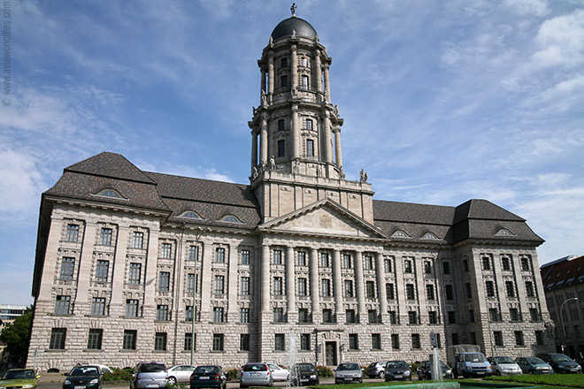
The Altes Stadthaus is an example of German Art Nouveau designed by Ludwig Hoffmann. This building is less decorative then the Majolica House, as because German Art Nouveau was less decorative. The building consist of a lot of geometric forms but what I find interesting is the effect the shade cast on to the building itself. (Altes Stadthaus, 2014)


Although Art Nouveau disappeared before the First World War, today it is still being practiced by designers and artists because of its beauty. We can see these revivals in forms of art, in fashion, graphic design, and jewelry and even in furniture and architecture.


Here is a modern take on modern Art Nouveau architecture using wood. The architects manage to combine organic and geometrical shapes together to create this beautiful exterior. The vertical lines create an interesting effect because of the shadows while the flowness and continuity of the organic lines create a sense of “freedom”. What is also interesting is the contrast between the wood and the glass material as well.


Bibliography

1.) The History of Art Nouveau – Painting-Drawing-Artist Documentary, 2014 (video file), Available from: <https://www.youtube.com/watch?v=zjy_XFUjSn0>. [Accessed 29 December 2014]
2.) Wolf, Art Nouveau, 2014, The Art Story, Available from: <http://www.theartstory.org/movement-art-nouveau.htm> [Accessed 29 December 2014]

Surrealism Art Essay


Surrealism is an art movement that originated from the Dadaism. Surrealism, in contrast of Dadaism, wanted to reestablish the strange, fun, imaginative and freedom of art itself. (The Life and Art of Salvador Dali – Discovery/History/Biography (documentary), 2014)


This movement consisted of strange paintings that manipulated everyday objects into a strange form. The founder of this movement is the French medical student and poet, Andre Breton in which he took inspiration from dreams as they symbolize the inner thought of one’s mind. During the early years of surrealism, it consisted more of a literary group until Italian paint “Giorgio De Chirico” filled the gap between romantic art and surrealism. (The Shock of the New – Ep5 – The Threshold of Liberty, 2014)

This painting by Giorgio De Chirico shows a similar dream like style of painting that is very common in surrealism. De Chirico wanted to show the torn world created because of World War 1 by using humanoid forms, destroyed architecture and dark, eerie streets. (Moma, The Song of Love) In my opinion the painting has a very interesting symbolist feel. The strange and out of the ordinary large object automatically attract the viewer and makes him ask questions because of the mysterious nature of the picture. Because of the mystery behind the picture, viewers would find it even more interesting as because we as humans, love and fear the unknown.

For surrealists such as Chirico’s student, Max Ernst, he believed that the irrational mind is the perfect source for this movement. Surrealist’s looks at three main sources such as the Children art they believed the innocent eye is not repressed as to that of adults. Madness and was also a large source for inspiration as surrealists believed this is the highest form of revoke to a tolerable world. The last source of the irrational was primitive art because of the “pure” look of the style. (The Shock of the New – Ep5 – The Threshold of Liberty, 2014)


During this movement, one of the most important figures of surrealism would be the Spanish painter, Salvador Dali. Dali’s work changed art during that time. He created paintings with illusions and often manipulated objects to appear somewhat differently; this method could be seen in the painting called “The Metamorphosis of Narcissus” were Dali converted Narcissus’ reflection into a hand holding an egg. Dali also was fascinated in “Double image” paintings as well. Dali commonly placed his inner memories, anxieties and sexual thoughts in his paintings. (The Life and Art of Salvador Dali – Discovery/History/Biography (documentary), 2014)

Persistence of Memory is considered as Dali’s most famous piece.  The painting shows a beach landscape in the background and 4 clocks melting in the foreground. Dali based this image from his home, Colombia. Dali wanted to show to confuse viewers of reality by painting small details on the decaying clocks. Some even say that the creature in the middle of the painting is a self portrait of Dali himself. (Moma, The Persistence of Memory)

Dali’s work ranged from paintings and fashion to even cinema. His work had a huge influence towards interior design because of the fun and original look they would have. Surrealism changed art even today. Interior designers still use surrealist style because of its fun and original nature. Surrealism painting is still in practice today and many contempory artists are influenced by Surrealism’s style, ideas and technique. (The Life and Art of Salvador Dali – Discovery/History/Biography (documentary), 2014)

Digital media is commonly used in contempory Surrealism art nowadays as it gives some advantages to easily manipulate pictures. An example for this could be seen in Saeed Khalifa’s surrealist gallery where he manipulates images together to create a dream-like image. (Artsy, Saeed Khalifa, 2014)


Bibliography

1.) The Life and Art of Salvador Dali – Discovery/History/Biography (documentary), 2014 (video file), Available from: <https://www.youtube.com/watch?v=GONauCKYj0s>. [Accessed 27 December 2014]
 2.) The Shock of the New – Ep5 – The Threshold of Liberty, 2014 (video file), <https://www.youtube.com/watch?v=f0HeSrqXKps >. [Accessed 27 December 2014]
3.) Arcandilla, Surrealism and how it is Used Today, 2011. Available from: <http://www.1stwebdesigner.com/inspiration/modern-surrealism-and-history/>. [Accessed 27 December 2014]

4.) Saeed Khalifa, Rokn V (2014), Arty, 2015, Available from: <https://artsy.net/artwork/saeed-khalifa-rokn-v>. [Accessed 27 December 2014]

Sunday 23 November 2014

Inspirations for Practical Work


What impressed me the most from Art Nouveau is its dedication to the aspect of aesthetics. The Art Nouveau style had been used in a wide range of media ranging from paintings and stained glass to architecture and furniture. For my textile test piece, I took a lot of inspiration from Sabina Frank's stained glass work.

The technique Frank used that really caught my eye is the organic movement of the lines and the selection of colours. I find that the effect of organic lines give out a "calm" look to the piece itself and in my opinion, gives a sense of continuity to the pattern. The selection of colours in my opinion, compliment each other. The position of the red colour next to the green helps to please the eye for the viewer while the yellow and red background give a nice border to center out the pattern.


Because of this, I wanted to recreate this effect on fabric. I chose fabric because of its organic and flowing characteristics. I chose an organic pattern and stitched different coloured fabric on to the pattern. The intensity of the colour was chosen to mimic the colour of the stained glass in Frank's work.


The Dada movement was a movement that relied on typography. This movement was created to combat art, ironically, it created an art style as well. The style didn't rely on aesthetics and focused more on colour and the positioning of the typography.

This style impressed me from its simplistic and ironic nature. One piece with Dadaism that inspired me was "Small Dada Evening" by Kurt Schwitters. This Dadaism piece has a combination of images, different type of text and and even different coloured words. The red letters at the back of the text and images help to make the viewer focus on them. The red letters with different rotations give a sense of movement as well. The way the text is "unorganized" give out a rebellious feeling as well, highly common in this movement. This made the piece very dynamic in my opinion.

I wanted to recreate this effect using different sized text and rotations to create a sort of movement throughout the page. I tried to achieve this effect by tilting the typography and start to move it throughout the page so the viewer follow the text till the bottom right corner of the page. This made the piece a little dynamic and "interactive" with the viewer.


Movement in paintings inspire me a lot. In my opinion, the sense of movement makes the painting or scenes more alive and makes the viewer think more while viewing the painting. I took some inspiration on impressionism.


In the painting "Sunrise" by Claude Monet shows a beautiful effect of movement because of the use of small repetition of lines to give the illusion of ripples and waves. What is also interesting is the red sun in the background. The viewer will automatically look at that focus point as it breaks repetition and the monochrome effect from the rest of the painting. We can also see this in the Symbolical painting "The Sphinx". The viewer will automatically look at the Sphinx not just because of it warm colour but also because it gives a greater sense of movement, and has a patterned that breaks repetition.


I wanted to create this effect by using coils in ceramics. Coils leave a linear shadow and creates a sense of movement because of the repetition of this line. I wanted to break the repetition by using different coils and organic shapes. This in my opinion makes the viewer focus more on that certain aspect of the piece.

Art Nouveau

Art Nouveau
From 1880s till the First World War, Western Europe and the United States witnessed the development of a new art movement called “Art Nouveau”. The two major influences of Art Nouveau were from the Art and Crafts movement by William Morris and the Japanese art style during that time. Art Nouveau style could be divided into two; one that consisted more of natural and organic shapes and design while the other that consisted more of geometric shapes. Organic Art Nouveau style is mostly influenced from nature and flow. Artists and designers were influenced by Art Nouveau thus many paintings, furniture and buildings were created with this new form of style. One could even find this art style in posters as well. The aim of this movement was to modernize design by using different and more new materials instead of the traditional ones. Art Nouveau started to lose its popularity during the 1920s, when fashion started to give way to Art Deco but made another come back during the 1960s in which is now seen as an important influence during the Modernism movement.


Sagrada Familia byAntoni Gaudi
This very large Catholic Church built by Antoni Gaudi combines both Gothic and Art Nouveau style of architecture beautifully. What’s interesting is that I find both of these style direct opposites of each other; Gothic is more geometrical and pointed in form while on the other hand Art Nouveau is more organic and flowing in style. The building was never complete and to this day, the building’s construction is being continued. As mentioned before, the building has a beautiful balance of organic and geometric design. The building also has a sort of value balance because of its interesting mixture of lines as a decorative feature. The position and size of the pillars in the middle also help to make the building more attractive and pleasing to the eye.

Art Nouveau Lillies by Sabina Frank

This contemporary Art Nouveau style stained glass has a simple yet effective decorative design. The colours complement each other while the position of the flowers gives a balance of positive and negative space. There is also a balance of organic and geometric lines as well.

References
1.) Gontar, Art Nouveau, Available from: http://www.metmuseum.org/toah/hd/artn/hd_artn.htm, [20 Novemeber]
2.) The Art Story, Art Nouveau, Available from: http://www.theartstory.org/movement-art-nouveau.htm, [20 November]

The Dada Movement

The Dada Movement
The Dada movement originated from Zurich by poets and artists that was a direct reaction towards all of the propaganda and slaughter during the events of World War 1. The style shocked everyone with its unique simplicity. The style quickly spread to many other countries as well. The artists didn't share a universal style but they shared some similar concepts. This anti-art movement consisted or art that rejected idealism, and wanted to represent the direct opposite of what art meant. Dada in addition as wanted to ignore aesthetics as well to further increase its rebellious style. Dada style was commonly represented with typographic styles or printed images. Many of these images didn't have any meaning what so ever as well; they were all dependent on the viewer’s point of view. After The First World War, many artists or designers that participated during this movement, started to practice surrealism. In contrast to the Dada movement, surrealism consisted of images and writings that usually depicted illogical and strange looking scenes that expressed the artist’s idea.
Today Dadaism and Surrealism is still found among us. The style is commonly found in gravity because of its rebellious nature. Some modern fashion trends also originated from Dadaism such as punk fashion. Dadaism is commonly found in the graphic design area as well. For example of this contempory Dadaism, one could look at “Nu Bodies” by Edward Fella.

Small Dada Evening by Kurt Schwitters 1923
This poster consisted of a lot of jumbled typography written on top of each other and some small images of hands, a deer’s head and an arrow. Bold red letters that spell “DADA” and written in various rotations as well. The poster has an asymmetrical balance between the size of the typography and colour. The thickness and the red colour of the letters that spell DADA all help the viewer to easily read these. They also help to make the poster to look somewhat more attractive to the eye as well. Since not all letters are written with the same font style, this breaks repetition and in my opinion makes the poster more interesting to look at as well.

References
1.) Linotype, Dadaism, Available from: http://www.linotype.com/786-18052/thedadamovementtoday.html, [20 November 2014]
2.) Oxford Art Online, Dada and Surrealism, Available from: http://www.oxfordartonline.com/public/page/themes/dadaandsurrealis, [20 November]
3.) Fella, 2010, Graphic Design and Postmodernism, September 3 2010, DCAIGA, Available from: http://dcaiga.blogspot.com/2010/09/graphic-design-and-postmodernismedward.html, [20 Novemeber 2014]
4.) Moma, Kleine Dada Soiree, Available from: http://www.moma.org/learn/moma_learning/2562-2, [20 November 2014]

Symbolism

Symbolism
Symbolism starts its origins from late 19th century France. Symbolism became famous and spread to Europe quickly. Symbolism’s began as a literary concept and soon gained its popularity by other artists who went against Naturalism and Realism. Symbolist painters believed that art should represent ideas and emotions rather than representing the natural world around us. Thus, Symbolist artists returned to the Romantics’ personal expressiveness. Symbolist paints achieved this expressiveness by experimenting with colour tones, line and composition, this would help the viewer understand the meaning or idea the artist is trying to express. Symbolism lasted till the beginning of the First World War (1914-1918).

Fernand Khnopff- The Caresses (or The Sphinx) (1896)
This painting by Fernand Khbopff shows the confrontation between a man and Cheetah-like sphinx. This painting shows a very mysterious, original and eye catching scene. It is also quite unusual as well. The sphinx was a creature that asked a riddle to people that encountered it, those who said the wrong answer would be killed. It is said that the painting shows the depiction of Oedipus, the man that answered correctly the sphinx’s riddle. Some art historians believe that the sphinx shows depictions of power, seduction and domination, common subjects that Khnopff represented in his work. I believe that the painting itself gives a very mysterious look. The sphinx looks dangerous and threatening, yet the man is still calm and seems to be not bothered by the presence of the sphinx. The woman’s face also gives out a strange and mysterious look because the animal’s body looks as if it is charging or attacking, yet her expression is rather quite calm. The interesting effect that the painting achieves is that one would automatically look at the cheetah’s body because of its striking yellow colour. Because of its posture one would automatically suggest that it’s charging or attacking, then one would start seeing the whole picture and the faces of the man and the woman completely show the opposite feel of a struggle. The painting shows the inclusion of the golden ration between the cheetah and the man. Khnoppff clearly balanced out the painting using dull and bright colours. This also helps the viewer to focus on the cheetah first.  There is also a balance between the sphinx and the background, as it is the only entity that depicts movement as the rest of the painting looks rather still as if they are frozen.

References
1.) Myers, Nicole, Symbolism, Available from: http://www.metmuseum.org/toah/hd/symb/hd_symb.htm. [19 November 2014]
2.) Howe, 19th Century Painting, Available from: http://www.bc.edu/bc_org/avp/cas/fnart/art/khnopff.html, [19 Novemebr 2014]
3.) Caresses by Fernard Khnopff, 2012, Available from: http://www.johncoulthart.com/feuilleton/2012/12/13/caresses-by-fernand-khnopff/, [19 November 2014]

Impressionism

Impressionism
Impressionism originated from Paris, France by a group of artists that wanted to show a modern looking style of life. During this time, artists were preoccupied with the expression of feelings and ideas. Impressionist wanted to invent a new technique and style on how to handle colour. Their work also revealed personal and spiritual direction. Characteristics of impressionist art style were that the artist gave importance to shape and distorted the forms. Artists also usually painted on the spot as well. A new technique on how to handle colour was also introduced during this movement called pointillism. This consisted of a lot of coloured dots next to each other that from a distance one would see a picture. The main artists during the Neo-impressionism movement were Seurat and Signac while Post-impressionism were Van Gogh, Gaugin and Cezame. At that time, this art style was greatly different and original and other paintings, thus many critics rejected this style as they found it to be unfinished or “sketch-like”.

Impression Sunrise – Claude Monet
This painting my Claude Monet was the painting that gave birth to the style of Impressionism. The unique style of this painting during that time wasn't praised by critics as well. Today it is praised for the movement that it had accomplished to create. Although Monet used simple brush strokes and simple colours, he still managed to achieve the illusion of a picture and even manage to create a lot of movement in the ripples with the use of small repeated lines. Monet also managed to create the illusion of depth with the use of atmospheric perspective as well. What makes this painting interesting is the intense red sun. Since all of the composition is blue, the small yet intense red colour at the center manages to balance out the whole painting. It also makes the viewer to focus on the sun more. In my personal opinion, the painting gives out a relaxed and calm impression because of the warm blue colour. I also find that the lone boat in the middle further increases the calmness of the scene as well. The rising Sun and the reflections give a focus point to the viewer and in my opinion, breaks repetition as well.

On The Way To Morning - Leonid Afremov 
This contempory pointism painting shows a beautiful nighttime scene. The artist clearly focused on the lighting and reflectivity of the lights themselves. The technique itself helps the artist to create beautiful reflections of the surroundings. The painting is well balanced with warm and cold colours as well.

References
1.) The National Gallery, The Guide to Impressionism, Available from: http://www.nationalgallery.org.uk/paintings/learn-about-art/guide-to-impressionism/guide-to-impressionism. [19 November 2014]
2.) Samu, Margaret, Impressionism: Art and Modernity, Available from: http://www.metmuseum.org/toah/hd/imml/hd_imml.htm. [19 November 2014]
3.) Yurasits, Analysis of Claude Monet's Impression Sunrise, Available From: http://blogs.longwood.edu/incite/2012/01/30/analysis-of-claude-monet%E2%80%99s-impression-sunrise/ [19 Novemeber 2014]