Sunday 23 November 2014

Inspirations for Practical Work


What impressed me the most from Art Nouveau is its dedication to the aspect of aesthetics. The Art Nouveau style had been used in a wide range of media ranging from paintings and stained glass to architecture and furniture. For my textile test piece, I took a lot of inspiration from Sabina Frank's stained glass work.

The technique Frank used that really caught my eye is the organic movement of the lines and the selection of colours. I find that the effect of organic lines give out a "calm" look to the piece itself and in my opinion, gives a sense of continuity to the pattern. The selection of colours in my opinion, compliment each other. The position of the red colour next to the green helps to please the eye for the viewer while the yellow and red background give a nice border to center out the pattern.


Because of this, I wanted to recreate this effect on fabric. I chose fabric because of its organic and flowing characteristics. I chose an organic pattern and stitched different coloured fabric on to the pattern. The intensity of the colour was chosen to mimic the colour of the stained glass in Frank's work.


The Dada movement was a movement that relied on typography. This movement was created to combat art, ironically, it created an art style as well. The style didn't rely on aesthetics and focused more on colour and the positioning of the typography.

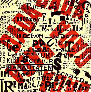
This style impressed me from its simplistic and ironic nature. One piece with Dadaism that inspired me was "Small Dada Evening" by Kurt Schwitters. This Dadaism piece has a combination of images, different type of text and and even different coloured words. The red letters at the back of the text and images help to make the viewer focus on them. The red letters with different rotations give a sense of movement as well. The way the text is "unorganized" give out a rebellious feeling as well, highly common in this movement. This made the piece very dynamic in my opinion.

I wanted to recreate this effect using different sized text and rotations to create a sort of movement throughout the page. I tried to achieve this effect by tilting the typography and start to move it throughout the page so the viewer follow the text till the bottom right corner of the page. This made the piece a little dynamic and "interactive" with the viewer.


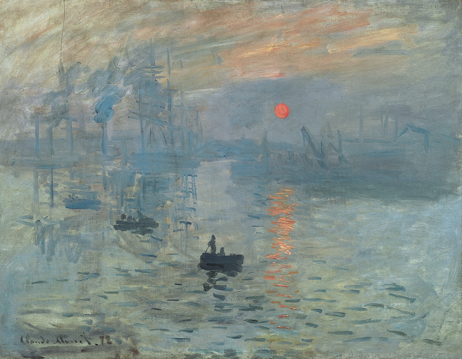
Movement in paintings inspire me a lot. In my opinion, the sense of movement makes the painting or scenes more alive and makes the viewer think more while viewing the painting. I took some inspiration on impressionism.


In the painting "Sunrise" by Claude Monet shows a beautiful effect of movement because of the use of small repetition of lines to give the illusion of ripples and waves. What is also interesting is the red sun in the background. The viewer will automatically look at that focus point as it breaks repetition and the monochrome effect from the rest of the painting. We can also see this in the Symbolical painting "The Sphinx". The viewer will automatically look at the Sphinx not just because of it warm colour but also because it gives a greater sense of movement, and has a patterned that breaks repetition.


I wanted to create this effect by using coils in ceramics. Coils leave a linear shadow and creates a sense of movement because of the repetition of this line. I wanted to break the repetition by using different coils and organic shapes. This in my opinion makes the viewer focus more on that certain aspect of the piece.

Art Nouveau

Art Nouveau
From 1880s till the First World War, Western Europe and the United States witnessed the development of a new art movement called “Art Nouveau”. The two major influences of Art Nouveau were from the Art and Crafts movement by William Morris and the Japanese art style during that time. Art Nouveau style could be divided into two; one that consisted more of natural and organic shapes and design while the other that consisted more of geometric shapes. Organic Art Nouveau style is mostly influenced from nature and flow. Artists and designers were influenced by Art Nouveau thus many paintings, furniture and buildings were created with this new form of style. One could even find this art style in posters as well. The aim of this movement was to modernize design by using different and more new materials instead of the traditional ones. Art Nouveau started to lose its popularity during the 1920s, when fashion started to give way to Art Deco but made another come back during the 1960s in which is now seen as an important influence during the Modernism movement.


Sagrada Familia byAntoni Gaudi
This very large Catholic Church built by Antoni Gaudi combines both Gothic and Art Nouveau style of architecture beautifully. What’s interesting is that I find both of these style direct opposites of each other; Gothic is more geometrical and pointed in form while on the other hand Art Nouveau is more organic and flowing in style. The building was never complete and to this day, the building’s construction is being continued. As mentioned before, the building has a beautiful balance of organic and geometric design. The building also has a sort of value balance because of its interesting mixture of lines as a decorative feature. The position and size of the pillars in the middle also help to make the building more attractive and pleasing to the eye.

Art Nouveau Lillies by Sabina Frank

This contemporary Art Nouveau style stained glass has a simple yet effective decorative design. The colours complement each other while the position of the flowers gives a balance of positive and negative space. There is also a balance of organic and geometric lines as well.

References
1.) Gontar, Art Nouveau, Available from: http://www.metmuseum.org/toah/hd/artn/hd_artn.htm, [20 Novemeber]
2.) The Art Story, Art Nouveau, Available from: http://www.theartstory.org/movement-art-nouveau.htm, [20 November]

The Dada Movement

The Dada Movement
The Dada movement originated from Zurich by poets and artists that was a direct reaction towards all of the propaganda and slaughter during the events of World War 1. The style shocked everyone with its unique simplicity. The style quickly spread to many other countries as well. The artists didn't share a universal style but they shared some similar concepts. This anti-art movement consisted or art that rejected idealism, and wanted to represent the direct opposite of what art meant. Dada in addition as wanted to ignore aesthetics as well to further increase its rebellious style. Dada style was commonly represented with typographic styles or printed images. Many of these images didn't have any meaning what so ever as well; they were all dependent on the viewer’s point of view. After The First World War, many artists or designers that participated during this movement, started to practice surrealism. In contrast to the Dada movement, surrealism consisted of images and writings that usually depicted illogical and strange looking scenes that expressed the artist’s idea.
Today Dadaism and Surrealism is still found among us. The style is commonly found in gravity because of its rebellious nature. Some modern fashion trends also originated from Dadaism such as punk fashion. Dadaism is commonly found in the graphic design area as well. For example of this contempory Dadaism, one could look at “Nu Bodies” by Edward Fella.

Small Dada Evening by Kurt Schwitters 1923
This poster consisted of a lot of jumbled typography written on top of each other and some small images of hands, a deer’s head and an arrow. Bold red letters that spell “DADA” and written in various rotations as well. The poster has an asymmetrical balance between the size of the typography and colour. The thickness and the red colour of the letters that spell DADA all help the viewer to easily read these. They also help to make the poster to look somewhat more attractive to the eye as well. Since not all letters are written with the same font style, this breaks repetition and in my opinion makes the poster more interesting to look at as well.

References
1.) Linotype, Dadaism, Available from: http://www.linotype.com/786-18052/thedadamovementtoday.html, [20 November 2014]
2.) Oxford Art Online, Dada and Surrealism, Available from: http://www.oxfordartonline.com/public/page/themes/dadaandsurrealis, [20 November]
3.) Fella, 2010, Graphic Design and Postmodernism, September 3 2010, DCAIGA, Available from: http://dcaiga.blogspot.com/2010/09/graphic-design-and-postmodernismedward.html, [20 Novemeber 2014]
4.) Moma, Kleine Dada Soiree, Available from: http://www.moma.org/learn/moma_learning/2562-2, [20 November 2014]

Symbolism

Symbolism
Symbolism starts its origins from late 19th century France. Symbolism became famous and spread to Europe quickly. Symbolism’s began as a literary concept and soon gained its popularity by other artists who went against Naturalism and Realism. Symbolist painters believed that art should represent ideas and emotions rather than representing the natural world around us. Thus, Symbolist artists returned to the Romantics’ personal expressiveness. Symbolist paints achieved this expressiveness by experimenting with colour tones, line and composition, this would help the viewer understand the meaning or idea the artist is trying to express. Symbolism lasted till the beginning of the First World War (1914-1918).

Fernand Khnopff- The Caresses (or The Sphinx) (1896)
This painting by Fernand Khbopff shows the confrontation between a man and Cheetah-like sphinx. This painting shows a very mysterious, original and eye catching scene. It is also quite unusual as well. The sphinx was a creature that asked a riddle to people that encountered it, those who said the wrong answer would be killed. It is said that the painting shows the depiction of Oedipus, the man that answered correctly the sphinx’s riddle. Some art historians believe that the sphinx shows depictions of power, seduction and domination, common subjects that Khnopff represented in his work. I believe that the painting itself gives a very mysterious look. The sphinx looks dangerous and threatening, yet the man is still calm and seems to be not bothered by the presence of the sphinx. The woman’s face also gives out a strange and mysterious look because the animal’s body looks as if it is charging or attacking, yet her expression is rather quite calm. The interesting effect that the painting achieves is that one would automatically look at the cheetah’s body because of its striking yellow colour. Because of its posture one would automatically suggest that it’s charging or attacking, then one would start seeing the whole picture and the faces of the man and the woman completely show the opposite feel of a struggle. The painting shows the inclusion of the golden ration between the cheetah and the man. Khnoppff clearly balanced out the painting using dull and bright colours. This also helps the viewer to focus on the cheetah first.  There is also a balance between the sphinx and the background, as it is the only entity that depicts movement as the rest of the painting looks rather still as if they are frozen.

References
1.) Myers, Nicole, Symbolism, Available from: http://www.metmuseum.org/toah/hd/symb/hd_symb.htm. [19 November 2014]
2.) Howe, 19th Century Painting, Available from: http://www.bc.edu/bc_org/avp/cas/fnart/art/khnopff.html, [19 Novemebr 2014]
3.) Caresses by Fernard Khnopff, 2012, Available from: http://www.johncoulthart.com/feuilleton/2012/12/13/caresses-by-fernand-khnopff/, [19 November 2014]

Impressionism

Impressionism
Impressionism originated from Paris, France by a group of artists that wanted to show a modern looking style of life. During this time, artists were preoccupied with the expression of feelings and ideas. Impressionist wanted to invent a new technique and style on how to handle colour. Their work also revealed personal and spiritual direction. Characteristics of impressionist art style were that the artist gave importance to shape and distorted the forms. Artists also usually painted on the spot as well. A new technique on how to handle colour was also introduced during this movement called pointillism. This consisted of a lot of coloured dots next to each other that from a distance one would see a picture. The main artists during the Neo-impressionism movement were Seurat and Signac while Post-impressionism were Van Gogh, Gaugin and Cezame. At that time, this art style was greatly different and original and other paintings, thus many critics rejected this style as they found it to be unfinished or “sketch-like”.

Impression Sunrise – Claude Monet
This painting my Claude Monet was the painting that gave birth to the style of Impressionism. The unique style of this painting during that time wasn't praised by critics as well. Today it is praised for the movement that it had accomplished to create. Although Monet used simple brush strokes and simple colours, he still managed to achieve the illusion of a picture and even manage to create a lot of movement in the ripples with the use of small repeated lines. Monet also managed to create the illusion of depth with the use of atmospheric perspective as well. What makes this painting interesting is the intense red sun. Since all of the composition is blue, the small yet intense red colour at the center manages to balance out the whole painting. It also makes the viewer to focus on the sun more. In my personal opinion, the painting gives out a relaxed and calm impression because of the warm blue colour. I also find that the lone boat in the middle further increases the calmness of the scene as well. The rising Sun and the reflections give a focus point to the viewer and in my opinion, breaks repetition as well.

On The Way To Morning - Leonid Afremov 
This contempory pointism painting shows a beautiful nighttime scene. The artist clearly focused on the lighting and reflectivity of the lights themselves. The technique itself helps the artist to create beautiful reflections of the surroundings. The painting is well balanced with warm and cold colours as well.

References
1.) The National Gallery, The Guide to Impressionism, Available from: http://www.nationalgallery.org.uk/paintings/learn-about-art/guide-to-impressionism/guide-to-impressionism. [19 November 2014]
2.) Samu, Margaret, Impressionism: Art and Modernity, Available from: http://www.metmuseum.org/toah/hd/imml/hd_imml.htm. [19 November 2014]
3.) Yurasits, Analysis of Claude Monet's Impression Sunrise, Available From: http://blogs.longwood.edu/incite/2012/01/30/analysis-of-claude-monet%E2%80%99s-impression-sunrise/ [19 Novemeber 2014]

Sunday 26 October 2014

Victorian Era

Victorian Era
During the Victorian Era, technology was slowly starting to improve and many important innovations took place during this time. These innovations included the blast furnace in which slowly started the production of steel, the print works, textile mills, the elevator and even typewriters. During this time, there was also an expansion in the middle class because of the rise of the industry and work. Because of this, people started to afford to live comfortably and could even buy some art works as well. Victorians loved to show off their possessions, thus houses were often very decorative. During this time, historicism was common as architecture and even interiors were built to imitate Gothic and rococo designs; such example of this would be the St. Pancras railway station as it was built in a Neo-Gothic style. During this time, there was also an increase in mass production because of the new technological advances.


William Morris
William Morris was a designer and leader of the arts and crafts movement. William Morris believed that machines were degrading creativity in design. He believed that handcrafts are far superior as it gives a sort of personal feel of the designer into the product. Morris was heavily inspired by nature ranging from plants to animals as well.


Red House 1859-1865
Red House is Neo-Gothic house design by William Morris and Philip Webb that shows a very unique design during that time. The rich red colour compliments the green grass around it. The grass helps to balance out the colour of the house. The balance of different angled lines help to give the house a powerful and complex look as well. The circled windows give a nice touch of visual balance as well.


References
1.) Victorian Architecture, Available from: http://en.wikipedia.org/wiki/Victorian_architecture [18 October 2014]
2.) The Victorians, [online video], 2014, https://www.youtube.com/watch?v=jBNFdP2xr7c (accessed on 18 October 2014)
3.) Loftus, 2011, The Rise of The Victorian Middle Class, Available from: http://www.bbc.co.uk/history/british/victorians/middle_classes_01.shtml [18 October 2014]
4.) Red House London, Available from: http://en.wikipedia.org/wiki/Red_House,_London [18 October 2014]

5.) William Morris part 2, [online video], 2011, https://www.youtube.com/watch?v=wL3Zu05KVGo (assessed on 18 October 2014)

The Pre Raphaelites

The Pre Raphaelites
The Pre Raphaelites were a group of English painters and critics that wanted to eliminate the predictability of academic art and go for a more direct, intensely coloured and simple approach of Italian painters before Raphael. Thus they focused to start emulating art from the late medieval to early Renaissance. The subject of the paintings varied but they drew inspiration from literary sources that gave them moral themes or stories. Because of this, they were quite loved by the Victorians. The Pre Raphaelites grew some controversy as well as they produced works with the subject of prostitution, religion and emigration as well. The founders of this group were John Everett, William Holman Hunt and Dante Gabriel.


Ophelia by John Everett 1851-1852
This painting by John Everett depicts the character of Ophelia from the Shakespeare play “Hamlet”. She is shown to be singing before drowning. The painting shows a very beautiful and realistic portrayal of nature. The woman is also highly detailed with a very decorative dress. I find that there is a balance in tone with her pale white skin and brightly coloured dress with the dark coloured water beneath her. This helps to bring out the character more. What I find interesting is the balance of the beauty of nature with that of death as well. It gives an ironic effect in my opinion. The balance of value is also present. I believe the dark toned shadows on the foliage help to enhance the colours more.


 An interesting aspect of this particular painting is that there is a form of a skull on the foliage. Although there is no evidence if this was intended or not, I find it quite well placed as it indirectly depicts the faith of Ophelia. This indirectly gives also a balance with the beauty of the scene.


References
1.) The Pre Raphaelites Brotherhood, Available from: http://en.wikipedia.org/wiki/Pre-Raphaelite_Brotherhood [18 October 2014
2.) Meagher, The Pre Raphaelites, Available from: http://www.metmuseum.org/toah/hd/praf/hd_praf.htm [18 October 2014]
3.) Tate, Opehial's Symbolism, Available from: http://www.tate.org.uk/learn/online-resources/ophelia/subject-and-meaning/ophelias-symbolism [18 October 2014] 

Saturday 25 October 2014

The Industrial Revolution

The Industrial Revolution
The origin of the industrial revolution started in England during the 18th century. Before this time, most people lived in a simple agricultural life, but then as the 18th century progressed, the industrial revolution began in which it transformed life with the help of new technology. During this time period, many important innovations began such as the use of coal, the first steam powered engine, railroads, factories, textile inventions, free trade and the iron industry. Although during this time, Britain gained maximum power and a lot of technological advancements, many people suffered for the cost of maximum gain. 


The Great Exhibition
During the 19th century, there was an international exhibition in London from 1st of May till the 11th. This exhibition, organized by Prince Albert and Henry Cole, celebrated the technological advancements and design. Many famous figures such as Charles Darwin and Charles Dickens visited this exhibition as well. This exhibition was held in a large glass building nick named “The Crystal Palace”.

The Crystal Palace

This large building, design by Joseph Paxton, held The Great Exhibition event. It was built with cast iron and plate glass; this gave the building a very unique form during that time. When one would see this building, one would see a balance of positive and negative space because of the iron and plate glass. I believe that during the day, the building would have reflected a lot of the sunlight because of the glass, thus it would have looked like its lit. The building has also showed balance on horizontal, vertical and curved lines as well. Inside the building, full sized Elm trees were also placed; this further gave a contrast between nature and architecture. This building was considered as an engineering success. The building was then moved to Sydenham where it was later destroyed by fire on the 30th of November 1939.

Architecture
In the 19th century, many historic styles were revived such as Neo-Moorish, Neo-Turkish, Neo-Egyptian and Neo-Gothic. These styles were very similar to the previous ones, but they were built using different and modern techniques.


Neo-Gothic Architecture: St. Patrick’s Cathedral
When one looks at The Cathedral of St. Patrick, one would immediately notice the similarities with Gothic-architecture. The building has a symmetrical balance with a balance of horizontal, vertical, curved and diagonal lines. This gives out a very complex look to the building. The building itself has an asymmetrical balance with its surroundings as the building looks very unique and different compared to the buildings around it. This attracts the eye of the viewer to look at the building.

Owen Jones
Owen Jones was an architect that was famous for his decoration design on the Crystal Palace and for the arrangements of the exhibits.  He is also known for his pattern catalog that he created called "The Grammar of Ornament". This involved of numerous of different pattern designs that could inspire and encourage designers to understand these patterns better. Each pattern in the catalog was very detailed and had vibrant colours. They were all balanced symmetrically balanced and many of them had complimentary colours as well.


References
1.) The Great Exhibition. Available from:http://en.wikipedia.org/wiki/The_Great_Exhibition [15 October 2014]
2.) Industrial Revolution, [online video], 2013, https://www.youtube.com/watch?v=JhF_zVrZ3RQ, (accessed 15 October 2014)
3.) Ben Johnson, The Great Exhibition of 1851, Available from: http://www.historic-uk.com/HistoryUK/HistoryofEngland/Great-Exhibition-of-1851/ [15 October 2014]
4.) St. Patrick's Cathedral (Manhattan), Available from: http://en.wikipedia.org/wiki/St._Patrick's_Cathedral_(Manhattan) [15 October 2014]
5.) Owen Jones (architect), Available from: http://en.wikipedia.org/wiki/Owen_Jones_(architect) [15 October 2014]

19th century Realism

Realism
The Realism art movement generated from 19th century France after the French Revolution. The main aspect of this movement was that it didn't depict any exaggerated drama or propaganda that was very common during the 18th century, but instead it depicted scenes of ordinary common people during their everyday activity such as working or even nature. Colours in Realism art is not exaggerated as well, instead, artists use natural colour to give a more realistic look. It is also very common that artists balanced out the paintings using warm and cold colours and also balancing out the scenery with the people in the area to help the viewer to focus on specific areas. Realism later helped the development of photography in the later future as well. Nowadays, Realism is still being practiced by many artists but the subject of the paintings has changed more to nature scenery than to people working.

The End of the Working Day 1886-87
This painting by Jules Breton depicts a beautiful scene of women working on the field. At first glance, one would automatically look at the sun because of its position and its intense orange colour. The colour of the women’s clothing, especially the one with the shovel, balances out the intense warm colour of the sun. Breton has also positioned the women at the center of the scene to give more focus on them. I also believe that this helps to balance the field background with the people as well. Breton has also balanced out the positive and negative space of the sky and the field. I find that the shade contrasts and enhances the colour of the scene as well. It is also quite interesting to note that the struggle of what the women are experiencing with the beautiful scenery creates a quite ironic scene.

She’s Mine
This contemporary painting by Cathy McCelland shows a very calm and beautiful landscape. The balance of colour of yellows, greens and blues give out beautiful effect. I also find that the tree and the birds balance out the negative space of the blue sky as well. The atmospheric perspective further enhances the realism of the paintings as well.

1.) Realism (art movement). Available from: http://en.wikipedia.org/wiki/Realism_(art_movement) [13 October 2014].

2.) Finocchio Ross. Nineteenth-Century French Realism. The Metropolitan Museum of Art. Available From: http://www.metmuseum.org/toah/hd/rlsm/hd_rlsm.htm, [13 October 2014]


Friday 17 October 2014

Introduction of Balance in Art and Design


Balance in art and design is one of principles that help the artist or designer to produce visually pleasing work. Balance works on all the elements of art;


  • Line: Horizontal, vertical, diagonal and curved lines
  • Shape: Organic and Inorganic shapes
  • Form: Geometric or non geometric forms
  • Colour: Warm and cold colours or complimentary colours
  • Value: Light and Dark
  • Texture: Smooth and Rough textures
  • Space: Positive and negative shape


One could also balance out his/her work with symmetry. Symmetrical balance pleases the eye as it creates harmony. Different types of symmetry create different and interesting works as well.
  • Symmetrical balance
  • Asymmetrical balance
  • Radial Balance


Throughout history, artists experimented with balance to create different art styles such as chiaroscuro
. Sculptors have also used balance to create the “perfect” looking faces and bodies as well thus creating the “golden ration”. Artists have also used colour and value balance to show hierarchy as well.  Designers have also experimented with balance to create interesting and attractive patterns and designs on fashion and even architecture. In interior design, colour balance is very important aspect to create visually pleasing interiors.